Calls to Action: Click Here to Learn Something New
Date: November 1, 2019
By: Shaun Pingitore
Click Here, Buy Now, Try Free….so many buttons! Which to choose?
What Are Calls to Action?
If you’re reading this, you’ve likely arrived by completing a Call to Action. Calls to Action are exactly what they sound like. You’re calling on a visitor on your site to perform a specific action. You may want them to make a purchase, fill out a form, or perhaps simply “Click Here” to go to another page of your website.
They come in many forms, often include a button, and their effectiveness certainly does vary. For instance, the mailing list sign-up at the bottom of our website is a call to action. We’re calling on you to join our mailing list!
On it’s own, this is not a very effective call to action, but that’s okay because the footer of the website is a small area with limited room for text, & we also include similar CTAs in many areas on our site.
Good vs Bad Calls to Action
An effective call to action is often coupled with text, video, or other content that entices a visitor to complete the action. It’s placed in an area that your eyes are naturally drawn to, which your designer should always be taking into account!
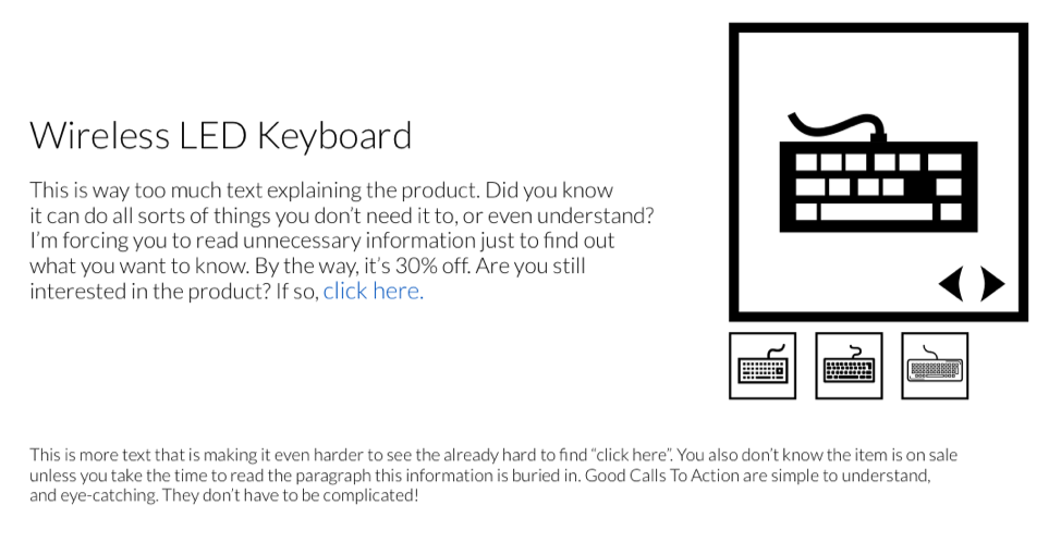
Bad calls to action often lack color, any sort of wow factor, and are not placed in a location that your eyes are naturally drawn to. Take a look at the below example, and think carefully about which button you may be more likely to click on.
Example 1

Example 2

Keep reading to find out which call to action we’ve been adding to our client’s sites, that we think is the most effective of them all!
Where Should I Put Them?
Where you should put a call to action is largely dependent on what it is, and what your goals are. Let’s use a website that sells products online as an example.
Having a customer make a purchase is obviously a very high priority activity for your business. In this case, you’ll want to have many “Buy Now” buttons or similar calls to action across multiple pages of your site.
On the other hand, our newsletter sign-up is a small form at the bottom of our site. We do this because visitors do not want to be bombarded with requests to do things like signing up for a mailing list. You already get enough emails!
Instead, what we do is try to deliver as much value as possible. Hopefully, our articles & content inspire a reader to want to learn more, then we conveniently place the sign-up form where it makes sense.
(On an unrelated note, make sure to Join The World of Bluedot for more articles like this!)
What is The Ultimate Call to Action?
If you’re viewing this on a phone or a tablet, you’ve probably already been staring at what we believe to be the most powerful call to action of them all!
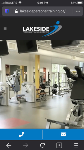
These days when we build sites for clients, we’ve been adding call/email buttons to the bottom or top of their site on the mobile view. This effectively turns your entire site into a call to action. If anything on your site resonates with a visitor, their thumb is likely hovering right over the call button! Talk about making it easy!
Click here to learn why mobile responsiveness on your website is massively important!
Here’s an example of what we mean:

How Should I Start?
When you’re building a new website or revamping your current site, make sure to be very clear with your designer about what you need visitors on your website to do.
Remember, it doesn’t need to be complicated! A simple, eye-catching button with a few lines of text and a picture is often all you need to drive more sales, get more sign-ups, or more leads.
On that note, if you’d like to like to learn more about how to improve your business’ presence online and get the most out of your website, make sure to Join The World of Bluedot so you don’t miss a thing!


